(51) You can draw right? Of course!! Cover Page Layout


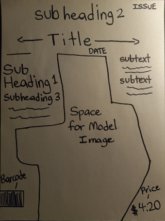
Hey guys so I've made a layout for our final cover page so I can get an idea of how I want it, so here go, I'll show you and then explain my thought process with you all-


In terms of font size- I plan to have the hierarchy be like this

-Largest-

Title
Sub Heading 1
Sub Heading 2
Sub Heading 2
Sub Text
Squiggly Line (Regular Text)
Issue - Date - Price

-Smallest-

I also plan to have 1 main image of our 1st model and barcode, as for the rest of the white space I would fill it with some abstract colors and maybe an image background if I'm feeling creative, but likely not as I feel it would distract, I'll look for a modern serif font for some of the larger pieces of text and use more simply and formal fonts for body text as it will be easier to read, the other small details will be easy as well. 

Anyways that's all for today guys, later I'll review the table of contents layout and then the double page spread layout.

Until then, thanks for reading!

Comments

Popular posts from this blog

(49) Your a star baby!! Model 2 Photoshoot

  WE CHILLING!? HUH, just kidding, welcome back guys, I think it's time for another banger of a photoshoot, this time it will be of our second model whom we will refer to as Demarcus. Let's not waste any more time, check out these pictures we did- Our photo shoots were done over a couple of days and he sent me a good bit of photos too to help save time, obviously this is about Men's Fashion so getting good photos takes a little longer, but it was clearly worth it, also on a side note I've decided we will be interviewing Tyrone for our actual feature story, so look forward to that! I hope you enjoyed our second model's photoshoot. Until next time, thanks for reading!

(64) It's a long story...Creative Critical Reflection #2

  --Dawn of the first day-- Hey guys welcome back to another blog, today we are going to be answering another question for my creative critical reflection. How does your product engage with audiences and how would it be distributed as a real media text? My magazine product targets men of course as it's a men's fashion magazine and it's made for men of all ages and backgrounds. I've made the magazine eye catching with flashy colors and intriguing cover lines. I've done this because it appeals to viewers easier and makes it easier to retain their attention while conveying my points across. The color scheme is mostly red and blue and I chose this specifically since red is a more energetic color and it calls for more attention and blue makes a good contrast to that which helps add emphasis in that design context. Since this is a magazine for all ages I did make use of some informalities and jokes such as calling the magazine the "Drip Edition" and adding cover...

(47) Don't hate me because I'm- The Models

Hey guys welcome back, I've got some models lined up, about 2, I asked some friends and they provided me some quality pictures they thought would be a good fit, so let's see them, also I'll be giving them some pseudonyms Here is our first model, we'll refer to him as Tyrone, he is pretty well-built and I think he'd fit in great with our magazine, since we're doing Men's Fashion, we'll ask him for some more photos later. I can confidently say he'll be in the cover page and the double-page spread! Now let's look at our second model- Ok, let me think of a funny pseudonym, alright we'll call him Demarcus, if your wondering where I got these names from, well it was from a list of the most beloved African American names. Anyways Demarcus is our second model, I think we could get better photos of him, this is just one he sent me. As for him I've decided to put he should probably go in the table of contents. Alright I hope you guys enjoyed this i...