
Can we fix it? No...oh well I wasn't expecting that, oh, wait this isn't Bob, wait WHO ARE YOU?! There can't be two...
OH, uhm, hey guys welcome back to a new blog! Today we are going to be discussing the anatomy of page design, which shouldn't be too difficult if you've been reading my blogs...you have been reading all my blogs right?! RIGHT?! Did I scare you? No? Your ears just hurt, alright that's fair. In all seriousness the terms for anatomy of page design that I will be covering are going be those of the elements that make up the layout of page design. If you are unfamiliar those elements/terms would be the headline, subheading, body text, images, and graphics. All of these terms contribute to the anatomy of page design and as such it would be wise we go over them and understand them more in depth. I will divide my explanation of these terms in two separate blogs, for this blog I will cover a bit about page layout, headlines, and subheadings. Let us begin!
Page Layout:
Page layout is basically the way that the various elements on the page are arranged. Page layout is typically created by a graphic designer, who uses their knowledge of design principles to create an organized and visually appealing arrangement of elements on the page.
A good page layout should be organized and balanced, with each element contributing to the overall look and feel of the page. The layout should also be easy to navigate, with the most important elements placed at the top of the page and the less important elements placed lower down. In addition to the placement of elements, the page layout should also take into account the typography, or the way that the text is formatted and arranged on the page. The font, size, and color of the text should be carefully chosen to enhance the readability and legibility of the page.
Overall, page layout is an essential element of the anatomy of page design, and it should be carefully considered and executed to create a visually appealing and effective page.
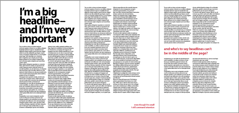
Headline:
The headline is used to grab the reader's attention and to summarize the main point of the article. It should be written in a clear and concise manner, and it should be easy to read and understand. The headline is typically the first thing that a reader will see when they look at a page, and it is therefore important that it is eye-catching and compelling.
A good headline should be relevant to the article and should entice the reader to continue reading. It should also be short and to the point, as readers often have limited time and attention. The headline should be placed at the top of the page, and it should be larger and bolder than the rest of the text on the page. This will help to draw the reader's eye to the headline and make it stand out from the rest of the page.
Overall, the headline is a crucial element of page design, and it should be carefully considered and crafted to help engage the reader and encourage them to continue reading.
Subheading:
The subheading is the smaller piece of text that appears below the headline. The subheading provides additional information about the article, and it helps to expand on the main point that was stated in the headline.
The subheading should be written in a clear and concise manner, and it should be easy to read and understand. It should also be relevant to the article and should help to entice the reader to continue reading. The subheading should be placed below the headline, and it should be slightly smaller and less prominent than the headline. This will help to create a hierarchy of information on the page, with the most important information appearing at the top and the less important information appearing lower down.
Overall, the subheading is a valuable element of page design, as it helps to provide additional information and context for the article, and it helps to guide the reader's eye and attention.
New things are always so top heavy huh. Anyways that's all for today's blog, look forward to the next one coming soon were I will discuss the remaining terms! As always,
Thanks for Reading!!
*Title Picture made using Canva
*Pictures generously sourced from free online materials (seriously)


Comments
Post a Comment