(21) Is it really a good morning?... House Styles PART 2!!!


I think I'm losing it, I've looked everywhere, but I just can't find it...OH THERE YOU ARE!! Welcome...back, I wasn't looking for you, no...I was looking for my...uhm MY GLASSES!!..."where are MY glasses?" ahhh gotcha, anyways lets get back to discussing house styles, well we already discussed it, so lets look at some examples,


Yes right away I think you guys can see the general theme and use of house styles in this magazine. It's pretty easy to spot. For one we can typically see an image of an individual in the cover, the magazine logo, in this case being XXL, and the use of large headings typically at the bottom left with a barcode at the bottom right.

Lets go over some more analyzed and high quality examples,


These are some very nicely analyzed examples and they easily searchable on the internet so credit to the google search "house style in magazine".

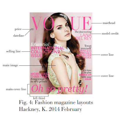
Anyways we can see that the Vogue magazine is clearly very streamlined in it's production and publication as is evident by how similar each magazine is published. I mean in each analysis we see the use of blank space, large headers typically at the bottom, models in the middle with their names given. We also see the magazine name at the top, the date typically on the top left under the title, and a cover or sell line usually on the left or right of the model.

So we already know that house styles is the standardization of development in media and magazines and this is evidently clear in the vogue magazine, after all they can't keep reinventing the wheel and they need to establish a brand so this is an effective way to establish uniqueness while also standardizing magazines for efficiency of publication. It's pretty cool and interesting to be honest, I might just try it with how I make my blog covers, standardized. Look forward to it haha.

Anyways that's all the time I have for you today beautiful people. Next blog we'll be diving in deeper with our magazine research.


Thanks for Reading!! 

*Title Picture made using Canva
*Pictures generously sourced from free online materials (seriously)


Comments

Popular posts from this blog

(49) Your a star baby!! Model 2 Photoshoot

  WE CHILLING!? HUH, just kidding, welcome back guys, I think it's time for another banger of a photoshoot, this time it will be of our second model whom we will refer to as Demarcus. Let's not waste any more time, check out these pictures we did- Our photo shoots were done over a couple of days and he sent me a good bit of photos too to help save time, obviously this is about Men's Fashion so getting good photos takes a little longer, but it was clearly worth it, also on a side note I've decided we will be interviewing Tyrone for our actual feature story, so look forward to that! I hope you enjoyed our second model's photoshoot. Until next time, thanks for reading!

(64) It's a long story...Creative Critical Reflection #2

  --Dawn of the first day-- Hey guys welcome back to another blog, today we are going to be answering another question for my creative critical reflection. How does your product engage with audiences and how would it be distributed as a real media text? My magazine product targets men of course as it's a men's fashion magazine and it's made for men of all ages and backgrounds. I've made the magazine eye catching with flashy colors and intriguing cover lines. I've done this because it appeals to viewers easier and makes it easier to retain their attention while conveying my points across. The color scheme is mostly red and blue and I chose this specifically since red is a more energetic color and it calls for more attention and blue makes a good contrast to that which helps add emphasis in that design context. Since this is a magazine for all ages I did make use of some informalities and jokes such as calling the magazine the "Drip Edition" and adding cover...

(47) Don't hate me because I'm- The Models

Hey guys welcome back, I've got some models lined up, about 2, I asked some friends and they provided me some quality pictures they thought would be a good fit, so let's see them, also I'll be giving them some pseudonyms Here is our first model, we'll refer to him as Tyrone, he is pretty well-built and I think he'd fit in great with our magazine, since we're doing Men's Fashion, we'll ask him for some more photos later. I can confidently say he'll be in the cover page and the double-page spread! Now let's look at our second model- Ok, let me think of a funny pseudonym, alright we'll call him Demarcus, if your wondering where I got these names from, well it was from a list of the most beloved African American names. Anyways Demarcus is our second model, I think we could get better photos of him, this is just one he sent me. As for him I've decided to put he should probably go in the table of contents. Alright I hope you guys enjoyed this i...